Table of Contents
ToggleIntroduction
A pivot chart serves as a visual depiction of the data extracted from a pivot table, offering users a dynamic means to summarize and delve into the data. By presenting information graphically, pivot charts facilitate the identification of trends, patterns, and outliers in the dataset, thus enhancing data analysis and decision-making processes.
Importance of Pivot Chart
Pivot charts are particularly useful for condensing large sets of data into more manageable visual formats. They allow users to interactively explore various aspects of the dataset, such as different categories, time periods, or variables, by adjusting filters and slicers directly on the chart. This interactivity enables users to gain deeper insights into the underlying data relationships and distributions.
Moreover, it offer a wide range of customization options, allowing users to tailor the visual representation to their specific needs and preferences. They can customize chart types, colors, labels, and other visual elements to better convey the insights derived from the data.
Why do we Use Pivot Chart?
Pivot charts are valuable tools in data analysis for several reasons. Firstly, they offer a dynamic way to visualize and explore complex datasets. By summarizing large amounts of data into manageable and insightful graphical representations, pivot charts enable users to quickly identify trends, patterns, and outliers. This makes it easier for analysts and decision-makers to grasp the key insights hidden within the data.
Secondly, it facilitate interactive analysis by allowing users to filter, sort, and drill down into the data dynamically. This interactivity empowers users to explore different aspects of the data and gain deeper insights into specific trends or segments. For example, users can filter the data by specific categories, time periods, or other variables to focus on relevant information.
Furthermore, the charts help in making data-driven decisions by providing clear and intuitive visualizations of the data. Whether it’s tracking sales performance, monitoring inventory levels, or analyzing customer demographics, pivot charts enable users to spot important trends and make informed decisions based on data-driven insights.
Creating Pivot Chart
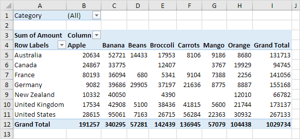
Here is a two-dimensional pivot table for your reference.
Insert Pivot Chart
To add a pivot chart, follow these steps.
1. Select any cell within the pivot table.
2. On the PivotTable Analyze tab, within the Tools group, select PivotChart.

The Insert Chart dialog box will be displayed.
3. Click OK.
Here is the pivot chart below, sure to captivate and leave a positive impression on your supervisor!
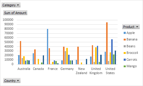
Please be aware that any modifications you apply to the pivot chart will be promptly mirrored in the pivot table, and conversely.
Filter Pivot Chart
To refine the data shown in this pivot chart, follow these steps.
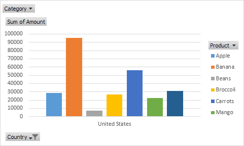
1. Utilize the standard filters (triangles adjacent to Product and Country). For instance, employ the Country filter to display solely the aggregate amount of each product exported to the United States.
2. Take out the Country filter.
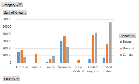
3. Since we included the Category field in the Filters section, we can now apply filters to this pivot chart (and pivot table) based on Category. For instance, you can use the Category filter to display only the vegetables exported to each country.
Change Pivot Chart Type
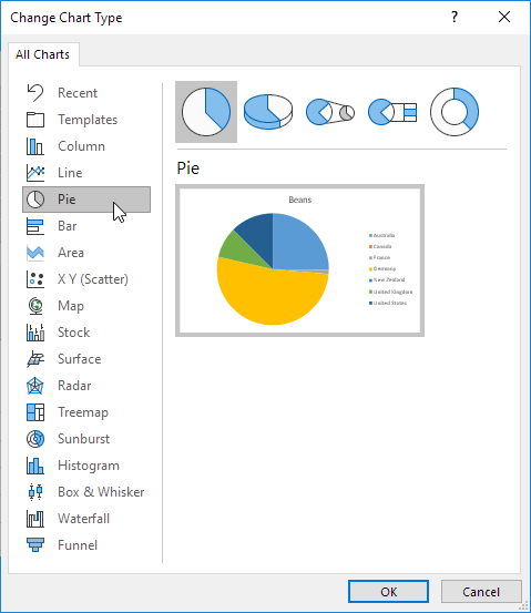
Pivot charts provide a range of chart choices, including bar charts, line charts, pie charts, and more. Select the chart type that best suits your data and analysis needs. In this blog post, I will demonstrate the use of a pie chart.
1. Select the chart.
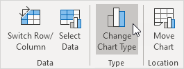
2. Click on the “Change Chart Type” option located in the “Type” group on the “Design” tab.
3. Choose Pie.
4. Click OK.
Below is the Result:
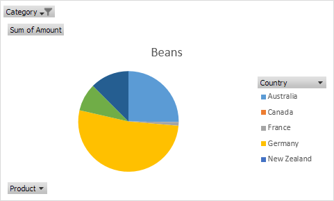
Note: Pie charts typically represent a single data series, such as Beans in this instance. To generate a pivot chart based on countries, you need to rearrange the data axis. Begin by selecting the chart. Then, navigate to the “Design” tab and locate the “Switch Row/Column” option in the “Data” group. Click on it to rearrange the data and create the pivot chart based on countries.
Conclusion
Pivot charts are essential instruments for analyzing data, providing a dynamic and visually captivating method to delve into and comprehend your data. By adhering to the steps detailed in this manual and trying out various chart setups, you’ll make significant progress in mastering pivot charts and extracting valuable insights from your data.
Frequently Asked Questions (FAQs)
What is a pivot chart used for?
A Pivot Table serves as a powerful tool for condensing, scrutinizing, investigating, and exhibiting summarized data. It enhance Pivot Tables by incorporating visual representations into the summarized data, making it effortless to discern comparisons, patterns, and trends.
How create a pivot chart?
Below are the steps to create Pivot Chart:
1. Click on any cell within your table.
2. Go to the “Insert” tab and choose “PivotChart.”
3. Choose the location where you want the PivotChart to be displayed.
4. Click “OK.”
5. Select the fields you want to display from the menu.
Why is it called a pivot chart?
A pivot table serves as a statistical instrument that condenses and rearranges chosen columns and rows of data within a spreadsheet or database table to generate a specific report. It doesn’t alter the original spreadsheet or database but rather allows users to pivot or rotate the data, offering various perspectives for examination.
What are the four elements of a pivot table?
Within it, there are four sections (Filters, Columns, Rows, and Values) where different field names can be positioned to construct a PivotTable. Additionally, the task pane contains a checklist area of fields for selection from the dataset.
How to delete PivotTable?
When you want to remove a PivotTable, choose the entire PivotTable and press the Delete key. If you encounter a “Cannot change this part of a PivotTable report” message, ensure the entire PivotTable is selected. Press Ctrl+A, and then press Delete again.

