Introduction
Grid in Bootstrap, the widely-used front-end framework, has completely transformed the landscape of web development with its powerful and versatile grid system.
This revolutionary feature lies at the heart of Bootstrap’s responsive design approach, enabling developers to effortlessly create dynamic and adaptable layouts.
In this informative blog post, we will delve deep into the intricate workings of Bootstrap’s grid system, equipping you with a comprehensive understanding that will empower you to craft visually stunning and responsive web designs.
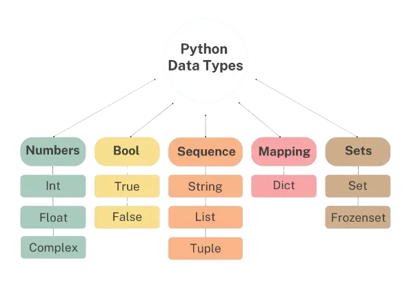
The grid system in Bootstrap is a fundamental tool that allows developers to organize and structure the content on a webpage in a systematic manner.

By providing a customizable grid layout, Bootstrap simplifies the process of creating responsive designs that can seamlessly adapt to different screen sizes and devices.
This eliminates the need for manually adjusting elements or creating multiple versions of a website for various devices.
At its core, Bootstrap’s grid system consists of 12 columns that can be divided up and combined to form different layouts.
Read About: Social Media is Fake
Understanding the Basics


Bootstrap’s grid system is a foundational structure used in web design, consisting of a 12-column layout that allows for a versatile and user-friendly approach.
This means that each row in your design is divided into 12 columns of equal width, providing an adaptable foundation for creating visually appealing and functional layouts.
Whether you are new to web development or an experienced professional, understanding the basic principles of Bootstrap’s grid system is crucial for creating effective and aesthetically pleasing designs.
By utilizing this framework, designers can easily arrange and organize various elements on a page, ensuring consistency and coherence throughout their website.
With its intuitive structure and customizable options, Bootstrap’s grid system offers both efficiency and flexibility for designers at any skill level.

So whether you are just starting out or looking to enhance your design skills, mastering the fundamentals of this powerful tool is essential for achieving success in the world of web design.
Container and Rows

As we begin to explore the concept of columns, it is essential to gain a thorough understanding of the two key components that form their structure: containers and rows.
These elements hold significant importance in determining the overall arrangement and structure of a website’s content.
A container is a fundamental building block of a column, serving as a designated space to hold various types of content.
It acts as a boundary that encapsulates and groups together specific information or design elements.
For example, on a website’s homepage, a container may be used to contain all the text and images related to a specific section, such as the “About Us” section.
Rows are a crucial element in the design and structure of columns.
They serve as fundamental horizontal separators, effectively dividing the space within each column into distinct and defined sections.
In essence, rows function as a means of creating individual compartments within containers, resulting in a highly organized and streamlined approach to displaying content.
By utilizing rows, the layout of columns is optimized for efficient organization and presentation of information. This allows for clear and concise categorization of content, ultimately enhancing the overall user experience.
Containers can be thought of as virtual boxes that encompass and contain all the content on a webpage.
They serve as a means to establish a consistent margin around the content, ensuring that it is visually appealing and easy to read.
In addition, containers also aid in maintaining proper alignment of the various elements within a webpage.
Rows, on the other hand, function as horizontal divisions within containers. They act as a way to group and arrange content in an organized manner.
Similar to how columns create vertical divisions, rows create horizontal ones, allowing for better structuring and presentation of information.
Together, these two components work hand in hand to provide a solid foundation for creating visually appealing and well-structured websites.
Responsive Design with Breakpoints
Bootstrap’s grid system is a highly effective tool for creating responsive designs.
By utilizing breakpoints, it allows for precise control over the layout of a webpage on various screen sizes, ensuring a smooth and consistent experience across all devices.
This feature is particularly useful when designing for different devices such as desktop computers, tablets, and smartphones.
With Bootstrap’s grid system, designers can easily adjust the layout to accommodate the varying screen sizes without compromising on the overall design aesthetic.
In addition to its many features, the grid system provides a vast array of possibilities for customization.
This allows designers to craft layouts that are truly one-of-a-kind and catered to their individual requirements.
With such a high degree of flexibility, the resulting designs not only look visually stunning, but also provide an exceptional user experience by offering optimized layouts for every type of device.
Whether it be a desktop computer, tablet, or smartphone, the grid system ensures that the design will adapt seamlessly and function flawlessly on any screen size.
This level of attention to detail and consideration for different devices greatly enhances the overall usability and accessibility of the design, making it more user-friendly and engaging for all audiences.
By giving designers the ability to fine-tune every aspect of their layout, the grid system empowers them to create truly unique and polished designs that stand out from the rest.
Additionally, Bootstrap’s grid system is incredibly intuitive and easy to use.
Designers can easily incorporate it into their workflow without any prior knowledge of coding or web development.
This makes it an ideal choice for both novice and experienced designers alike.
Offset and Nesting

In order to create a more visually appealing layout with appropriate spacing between columns, you can utilize the convenient offset-* classes.
These classes effectively shift a column to the right by a specific number of columns, providing a simple and efficient way to add space between elements.
By incorporating these classes into your design, you can easily control the amount of space between columns and ensure that your overall layout appears organized and well-balanced.
This feature is particularly useful when dealing with larger amounts of content or when striving for a more professional and polished look.
Whether it’s for aesthetic purposes or for functional reasons, the offset-* classes offer a versatile solution for creating spacing within your columns with precision and ease.
C onclusion
Bootstrap’s grid system is a fundamental and adaptable tool that provides developers with the ability to craft dynamic and visually captivating web layouts.
This innovative framework utilizes a 12-column grid layout, allowing developers to effortlessly design flexible and responsive designs that cater to various screen sizes.
With its advanced features and intuitive structure, Bootstrap’s grid system is an indispensable resource for creating stunning and user-friendly websites.
By following this standardized grid pattern, developers can easily adjust the layout of their websites to fit any device or screen resolution, resulting in a seamless user experience across all platforms.
Whether it’s a desktop computer, tablet, or mobile phone, Bootstrap’s grid system ensures that the website will look aesthetically pleasing and function flawlessly on all devices.
Its versatility and efficiency make it an essential tool for modern web development, providing endless possibilities for designing eye-catching and functional websites.
To fully harness the power of Bootstrap’s grid system, it is crucial to understand its fundamental concepts.
The grid is divided into rows and columns, with content being placed within these designated areas. By using CSS classes such as “container” and “row”, developers can control the width and alignment of their content.
One of the most notable and practical benefits of utilizing Bootstrap’s grid system is its unparalleled flexibility in adapting to a wide range of screen sizes.
This versatile feature is achieved through the clever implementation of breakpoints, which are predetermined points in the layout where it will automatically adjust according to the device’s screen size.
This means that whether you are browsing on a large desktop monitor or a small mobile phone, the website will seamlessly adapt and optimize its layout for an optimal viewing experience.
This exceptional adaptability makes Bootstrap’s grid system highly efficient and user-friendly for all types of devices.
Accordion #1
Lorem ipsum dolor sit amet, consectetur adipiscing elit. Ut elit tellus, luctus nec ullamcorper mattis, pulvinar dapibus leo.
Accordion #2
Lorem ipsum dolor sit amet, consectetur adipiscing elit. Ut elit tellus, luctus nec ullamcorper mattis, pulvinar dapibus leo.